I don't have much time right now, but I do want to get these ideas down quick and I can edit and add later.
I have been trying to figure out ways to synchronize my locally stored Guild Wars files such as screenshots and skill templates across all computers that I run the game on. In the process, I discovered a few programs that have some interesting properties.
Drop Box was the first program I downloaded. It had potential because so many people were talking about it. The service is great in the sense that it synchronizes all files in your drop box on any computer, including Mac and Linux. It also stores copies on a remote server so that if you somehow lost the file while on a road trip and didn't leave your computers on at home to sync too, chances are that the files are available on the server. This all occurs behind the scenes once you have it set up. Now for the downside. I am an organization junkie when it comes to computers. I want things very specifically classified and I prefer to keep my directory structure instead of dragging files that I want to sync to a single drop box. That is reminiscent of the days of the old windows briefcase and I never liked that. I wanted the files to sync from their respective homes in my directory, not from one folder.
This is when I downloaded FolderShare, a microsoft program that is also free of charge. The only limitation here is that it does not run on Linux. It does exactly what I want, it automatically syncs folders no matter where they are in my directory with another computer. This allowed me to sync Guild Wars on one computer where the program is on a separate drive with the other two computers that have Guild Wars under C:/ . The only downside is that the computers have to be on to see the updates because they are not stored on a server. But that is minor because this is the exact functionality I wanted.
The two programs combined is a powerful set indeed and quite capable of handling your synchronization needs. The only thing that could be better is a program where you could choose which folders you want to just sync and which ones you want to store online as well. With such a service, you could also say which folders or even individual files you want to share with what other users of the service to allow for collaboration. Unfortunately, you can't use symbolic links as Drop Box sees it as a file not as a link. However, I imagine that soon Drop Box will allow for synchronization to other folders in any directory, and when that happens FolderShare will die out. But for now, I'll use both, especially since FolderShare was a breeze to set up.
Apple Feedback
Tuesday, October 14, 2008
Thursday, August 14, 2008
An Eval of Chat Clients
As I mentioned in the previous post, I have had some issues with the available chat clients for Mac OS. I thought I should delve into that a little bit more, just to get some detail in.
First issue; I've downloaded all of the standard chat software that offers a Mac counterpart and I've discovered that even though the distributors make a Mac version, that version doesn't always have all the features of the Windows ones. For example, I stated that Yahoo had Yahoo Games integrated with the chat client, well, the Mac version of Yahoo is nothing more than a simple client capable of sending and receiving messages and files. All other features of Yahoo chat that are in the Windows version are inexplicably missing. And I say inexplicable, because I believe those games are in Java, a multi-os platform, they apparently just got lazy about their chat client for their Mac users. Incidentally, Google Talk is only available as a web based app for Mac.
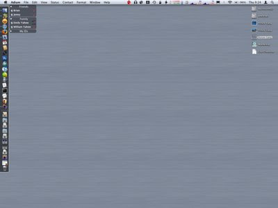
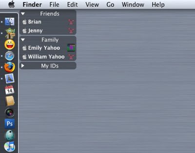
MS Messenger is simple to begin with, so there were few changes in the Mac version. You're not missing much by not having it and strange enough, the yahoo client for Mac can use windows live. iChat can connect to several different servers too. As a matter of fact, the only 2 programs that can connect to more than one service at a time are iChat and Adium. So, while Adium has the distinct disadvantage of not being able to send and receive files (there are actually mixed results with that) it does have the great advantage of Trillian in that it can connect to almost any chat client and maintain several logins to the same one at the same time. Plus, Adium is definitely a Mac app in that it is fully skinable and has an appropriate menubar icon, etc. And I have to say, the skinable options make it soooooooo much better than the others. It looks better and is much less intrusive as my contact list sits in a smoky gray box on my desktop, see the images below. The first image is just my desktop as a whole, the Adium contact list sits in the upper left. The second image shows a closeup of Adium. The important part is that you can't do this with any of the other chat clients, including iChat. This is a very strong case for Adium as most users want a chat client that integrates nicely and is unobtrusive while still being personalized. Adium is simply the only chat client to achieve these goals.
So, how do I handle the issue of not being able to send and receive files? Well, as inconvenient as it is, I often use the regular yahoo chat client for that. I've looked into other options such as web based file storage but the free ones are very limited and require that the person retrieving the file also sign up, plus that method is slow.
Me: "He, I'm sending you a file, go to this website in a few minutes to download it. It is called abc.jpg."
My Friend:"Where is it again, I can't find it?"
Me:"Click on the link that says Downloads and go to My Pictures, then to ....."
You get my point.
I've considered FTP type solutions as well, again, most people don't even know what FTP is let alone how to use it. Plus, they're not likely to want to download a new program just so they can access your personal FTP space. The chat clients really do make things easier. Most people I chat with already have Yahoo installed. I can talk to them in Adium and if they want to send a file I can open the Yahoo chat. It happens so rarely that there is no need to start with that. Supposedly, Adium will have support for sending and receiving files, when that day comes I will be overjoyed. Until then, I guess I have to put up with the fact that most software designers don't want to include Mac when the majority of their users are PC based. Again, I could start with the Yahoo client, but Adium offers skins and the ability to connect with several chat services. I love this because I can choose in one program what IDs are online and which are not. I can have multiple logins on a single service thereby separating my professional, family, and social lives. In short, Adium is the king-god chat app for Mac. At least for now.
Apple Feedback
First issue; I've downloaded all of the standard chat software that offers a Mac counterpart and I've discovered that even though the distributors make a Mac version, that version doesn't always have all the features of the Windows ones. For example, I stated that Yahoo had Yahoo Games integrated with the chat client, well, the Mac version of Yahoo is nothing more than a simple client capable of sending and receiving messages and files. All other features of Yahoo chat that are in the Windows version are inexplicably missing. And I say inexplicable, because I believe those games are in Java, a multi-os platform, they apparently just got lazy about their chat client for their Mac users. Incidentally, Google Talk is only available as a web based app for Mac.
MS Messenger is simple to begin with, so there were few changes in the Mac version. You're not missing much by not having it and strange enough, the yahoo client for Mac can use windows live. iChat can connect to several different servers too. As a matter of fact, the only 2 programs that can connect to more than one service at a time are iChat and Adium. So, while Adium has the distinct disadvantage of not being able to send and receive files (there are actually mixed results with that) it does have the great advantage of Trillian in that it can connect to almost any chat client and maintain several logins to the same one at the same time. Plus, Adium is definitely a Mac app in that it is fully skinable and has an appropriate menubar icon, etc. And I have to say, the skinable options make it soooooooo much better than the others. It looks better and is much less intrusive as my contact list sits in a smoky gray box on my desktop, see the images below. The first image is just my desktop as a whole, the Adium contact list sits in the upper left. The second image shows a closeup of Adium. The important part is that you can't do this with any of the other chat clients, including iChat. This is a very strong case for Adium as most users want a chat client that integrates nicely and is unobtrusive while still being personalized. Adium is simply the only chat client to achieve these goals.


So, how do I handle the issue of not being able to send and receive files? Well, as inconvenient as it is, I often use the regular yahoo chat client for that. I've looked into other options such as web based file storage but the free ones are very limited and require that the person retrieving the file also sign up, plus that method is slow.
Me: "He, I'm sending you a file, go to this website in a few minutes to download it. It is called abc.jpg."
My Friend:"Where is it again, I can't find it?"
Me:"Click on the link that says Downloads and go to My Pictures, then to ....."
You get my point.
I've considered FTP type solutions as well, again, most people don't even know what FTP is let alone how to use it. Plus, they're not likely to want to download a new program just so they can access your personal FTP space. The chat clients really do make things easier. Most people I chat with already have Yahoo installed. I can talk to them in Adium and if they want to send a file I can open the Yahoo chat. It happens so rarely that there is no need to start with that. Supposedly, Adium will have support for sending and receiving files, when that day comes I will be overjoyed. Until then, I guess I have to put up with the fact that most software designers don't want to include Mac when the majority of their users are PC based. Again, I could start with the Yahoo client, but Adium offers skins and the ability to connect with several chat services. I love this because I can choose in one program what IDs are online and which are not. I can have multiple logins on a single service thereby separating my professional, family, and social lives. In short, Adium is the king-god chat app for Mac. At least for now.
Apple Feedback
Sunday, July 27, 2008
The Question of Apple vs. Others
It dawned on me that after using Entourage for almost 4 months, that I don't really like it. There are things, but I'm struck by bigger things. For example, Apple releases updates and bug fixes more regularly that MS has. At least, I've never been notified of a fix for Entourage. Maybe they think it works perfectly, and maybe monkeys will fly out of my butt.
The fact is, I use a Mac for simplicity, ease of use, quality software, etc. Many would say I should be struck down for even installing MS software at all. But the office suite is a standard that everyone uses, you really can't get around using it yourself. But Entourage is different, it is just an email application. Unless you are in a business where you must connect to an exchange server and share calendars, address book, and such, then there really is no need for it. I do like that it seems to have a smaller memory footprint than Mail alone, let alone if iCal and Address Book are running as well. But memory isn't everything. I hate the little reminder box and the fact that I can't change the snooze time. While printing envelopes in Word requires the use of Entourage, I've found that Address Book does a fine job on it's own, even allowing you to place an image as part of the return address, all effortless and automatic for all selected recipients.
Mail allows for emails to be grouped by thread or by date. The thing I miss is the date header that Entourage has, it makes it so much easier to see what date things were received on. However, I normally prefer that messages are grouped by thread, although an auto expand would be nice instead of having to navigate to that tiny little arrow. Plus, if I've received a new message in a thread, I don't want to click the thread, then click the message, how about just opening the most recent message in the thread on the first click while expanding the thread, that would be awesome.
I've also determined that I want the dashboard back. I've been using yahoo widgets, but they always change position on me when I switch to dual monitor view. That is getting old quick. Plus, not one single widget seems to interact with software at all, and PearLyrics is my favorite dashboard widget which adds lyrics to any iTunes song playing, if the lyrics can be found. But the yahoo widgets are limited and seem to be designed around PCs more. Although there are many more widgets to choose from and the memory footprint is also small. But again, it just doesn't feel Apple.
The one Mac only app that truly annoys me is Adium, in that it still can't transfer or receive files. What I want is a chat client that can handle multiple chat logins on different services and still handle all the functionality of those services like yahoo games. My wife and I used to have lots of fun with that when she was traveling for work. But since most chat clients are originally written for PC, that's asking too much. If I had more mac friends, I'd use iChat. Unfortunately, you have to have friends and iChat can only handle a few services and definitely not the ones I use the most. Plus, Adium does have a fun interface with all the options to change how it looks, you can pretty much make it your own.
Anyway, as of today I'm going back to Mail/Address Book/iCal and dumping Entourage entirely. Not only is it too MS-like, but the address book part and sync services totally messed up my Apple Address book. Now I have to spend a few hours correcting duplicate phone numbers, email address, and adding my photos of people back. Very lame.
For anyone looking to switch to Entourage, I advise that you wait until it can really offer you something. The hardest part about the switch is getting your address book moved over, but you also have to import mail which isn't smooth as butter and rules have to be created manually. In short, MS didn't work very hard to make sure the switch was easy and by reformatting as much as they did, they didn't make it easy to switch back either.
Apple Feedback
Thursday, March 27, 2008
The Holy Grail of Music Managers
Songbird has been the subject of much discussion on the www these days. And it makes perfect sense as to why. While some previous releases were unstable, release 0.5 has been awesome. But I digress... I have to tell you what it is.
Songbird is the best thing to happen to Mac OS X, that's what it is. Any Mac user who ever used to use Windows knows that there are much better alternatives to iTunes, and for good reason. iTunes lacks a temporary playlist. You can't skin it in Mac OS X, although I hear you can in Windows. You can't really change the interface any. Sure, there are lots of great plug-ins, but it still doesn't change the fact that if you compare the features in iTunes to those of Windows Media Player, it's a downright disgrace. Enter... Songbird.
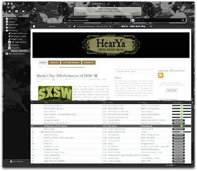
Songbird is built on Mozilla, it incorporates a browser, a media library, and a smorgasbord of plug-ins, many of them ported directly from Firefox and Thunderbird. But, my favorite part is how Songbird can find all the mp3s in a blog or webpage. This saves me the time of looking for each one, downloading them and playing them. I can play them without permanently downloading, and I can download them if I wish. If you don't think this is a big deal, just pay attention to the direction the innanet is going these days. Social networking is the biggest craze with new sites coming out all the time. I recently found one where you can upload anything to a virtual desktop. Your friends can play any file you put up, video, music, whatever. It's sure to be the next big hit because this is the best way to get your unique videos or music out to your distant friends, all from one location. Anyway, the ability to view these and any other site in Songbird and listen to the songs as if there were on your computer makes Songbird a must have. Not to mention, it's on every major platform, and as we've seen from Mozilla, that usually means it has to succeed. I should do more than just talk about it, here is Songbird on my system playing mp3s from Hear ya, the indie music blog.
I'm not showing all the plug-ins, some do have some bugs that cause excessive RAM usage. It supports tabs like Firefox, it supports my iTunes Library which is awesome. There are plug-ins to sync with your iPod or other devices. By version 0.6 they're expecting to have GStreamer support, which I believe will allow you to share your Songbird Library over a network. Since it's cross platform, that will be good for me. My wife is a big music fan, knows the song/album/artist names of just about anything she hears, and I know that once I tell her of the ability to find new music using the built-in Skreemer search engine or the ability to play a music blog, she'll never use iTunes or Yahoo Music again.
I stress that the developers still claim that their stable releases are for beta testers. I'm sure they won't change their minds on that until release 1.0. As good as it is now, I can only imagine how wonderful their first truly public release will be. Best of all, it's all open source and free. There is no doubt that as long we all all provide them our support, they will create the best music manager ever. Go to birdhouse.songbirdnest.com now and get your copy, you won't regret it!
Apple Feedback
Songbird is the best thing to happen to Mac OS X, that's what it is. Any Mac user who ever used to use Windows knows that there are much better alternatives to iTunes, and for good reason. iTunes lacks a temporary playlist. You can't skin it in Mac OS X, although I hear you can in Windows. You can't really change the interface any. Sure, there are lots of great plug-ins, but it still doesn't change the fact that if you compare the features in iTunes to those of Windows Media Player, it's a downright disgrace. Enter... Songbird.
Songbird is built on Mozilla, it incorporates a browser, a media library, and a smorgasbord of plug-ins, many of them ported directly from Firefox and Thunderbird. But, my favorite part is how Songbird can find all the mp3s in a blog or webpage. This saves me the time of looking for each one, downloading them and playing them. I can play them without permanently downloading, and I can download them if I wish. If you don't think this is a big deal, just pay attention to the direction the innanet is going these days. Social networking is the biggest craze with new sites coming out all the time. I recently found one where you can upload anything to a virtual desktop. Your friends can play any file you put up, video, music, whatever. It's sure to be the next big hit because this is the best way to get your unique videos or music out to your distant friends, all from one location. Anyway, the ability to view these and any other site in Songbird and listen to the songs as if there were on your computer makes Songbird a must have. Not to mention, it's on every major platform, and as we've seen from Mozilla, that usually means it has to succeed. I should do more than just talk about it, here is Songbird on my system playing mp3s from Hear ya, the indie music blog.

I'm not showing all the plug-ins, some do have some bugs that cause excessive RAM usage. It supports tabs like Firefox, it supports my iTunes Library which is awesome. There are plug-ins to sync with your iPod or other devices. By version 0.6 they're expecting to have GStreamer support, which I believe will allow you to share your Songbird Library over a network. Since it's cross platform, that will be good for me. My wife is a big music fan, knows the song/album/artist names of just about anything she hears, and I know that once I tell her of the ability to find new music using the built-in Skreemer search engine or the ability to play a music blog, she'll never use iTunes or Yahoo Music again.
I stress that the developers still claim that their stable releases are for beta testers. I'm sure they won't change their minds on that until release 1.0. As good as it is now, I can only imagine how wonderful their first truly public release will be. Best of all, it's all open source and free. There is no doubt that as long we all all provide them our support, they will create the best music manager ever. Go to birdhouse.songbirdnest.com now and get your copy, you won't regret it!
Apple Feedback
Friday, February 29, 2008
The Difference between a blog and a Wiki
Today I wanted to develop some way to find all my Mac OS tips and tricks. I normally store all my Unix and Mac tips in notes inside of Mail. It seems convenient enough, but not easily searchable and I don't really care for the way the Notes part of Mail actually works.
I began looking for other methods, first with Mind Mapping software, then I started thinking on Wiki terms. I mean, what better way, it's hierarchical like files and folders in a directory tree, it's easy to navigate and search through keywords, it's logically organized as opposed to random stuff hanging all over. So, today, I created my own Wiki. On this Wiki I will post tips and tricks to making Mac OS X your own. Everything from tips to get rid of the 3D dock in Leopard, to underlying Unix tips will be added in a structured environment and it will be available to the internet community at large. I doubt I have any readers of my blog, but my Wiki should prove to be more interesting. If you'd like to contribute or learn some new things about how to make OS X behave the way you want it to, go to tomsmac.wetpaint.com.
Apple Feedback
Tuesday, February 26, 2008
Global Hotkeys
I knew that there had to be a simple way to get global hotkeys without having to pay for software. Granted, Quicksilver can do global hotkeys, but I don't use it anymore because it seems to have issues with crashing, memory leaks, and the new spotlight does a decent enough job for me. Anyway, this link http://www.monkeybreadsoftware.de/Freeware/GlobalHotkey.shtml has a simple program with some examples as to how it runs.
The program runs hidden, you wouldn't notice it unless you open up your activity monitor. Which also means that it doesn't install itself, so if you want it to run all the time, you'd be best to add it to your login items group. It took me a little while to figure out what it did and didn't like though. It was finicky about my file format, you can't save an applescript and have it run it. It is capable of running applescripts, shell scripts, and applications, but to do so you have to follow some rules.
Now, you might ask why you would want an application that still requires you to manually assemble the code? Well, if you want it all done for you, then you'd better buy a program because I only wanted this for simple features. I wanted a global hotkey to advance through my iTunes playlist without having to bring iTunes up front. I might also want a global hotkey to launch a specific application, or to refresh my Dock, SystemUiServer, or Finder. A standard program that allows you to assign hotkeys usually doesn't allow for shell scripting. All you need to know is what command you want to run, whether it's applescript, shell scripts, or an application, and you create a simple text file with the command. Of course, test your applescripts with script editor first, make sure they work, then copy it into a new text document. But, there is a trick here and I will try to make it simple.
First, open TextEdit.app. As an example, add this text to a new blank document
tell application "iTunes" to play
Now, save the document under the name of a keystroke (one that isn't used by system services or any other application menus, I've chosen F5). Notice in my screenshot that I have chosen not to include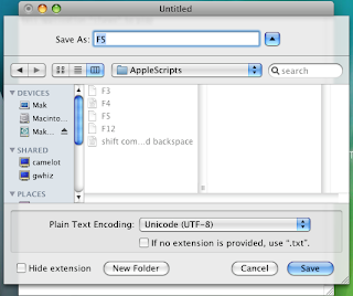 the extension and that I've selected a Unicode type text file format. If the file name includes any extension or is otherwise not a series of keystrokes such as; command option j, option 4, etc., then the command will not work. Also, it should be saved in the folders that came with the application. I saved the contents of the opened .dmg file in a folder called Global Hotkey. Ensure that this file is being saved in the Global Hotkey/Applescripts folder. Double click the app, Global Hotkey.app, use F5 to play iTunes. I actually put in playpause and F4. I created two more scripts just like this and assigned back track to F3, playpause to F4, and next track to F5. Now, as long as the app is running I will always maintain control of my iTunes no matter what application I'm actually working in.
Similarly, all you have to do to launch an application is create an alias, drag it to Global Hotkey/Applications and rename it to another valid keystroke. Personally, I don't have much need for this as I'm satisfied with using Spotlight, but maybe you want to launch something that is in a folder or on a drive that spotlight is not monitoring, then there you go.
Apple Feedback
The program runs hidden, you wouldn't notice it unless you open up your activity monitor. Which also means that it doesn't install itself, so if you want it to run all the time, you'd be best to add it to your login items group. It took me a little while to figure out what it did and didn't like though. It was finicky about my file format, you can't save an applescript and have it run it. It is capable of running applescripts, shell scripts, and applications, but to do so you have to follow some rules.
Now, you might ask why you would want an application that still requires you to manually assemble the code? Well, if you want it all done for you, then you'd better buy a program because I only wanted this for simple features. I wanted a global hotkey to advance through my iTunes playlist without having to bring iTunes up front. I might also want a global hotkey to launch a specific application, or to refresh my Dock, SystemUiServer, or Finder. A standard program that allows you to assign hotkeys usually doesn't allow for shell scripting. All you need to know is what command you want to run, whether it's applescript, shell scripts, or an application, and you create a simple text file with the command. Of course, test your applescripts with script editor first, make sure they work, then copy it into a new text document. But, there is a trick here and I will try to make it simple.
First, open TextEdit.app. As an example, add this text to a new blank document
tell application "iTunes" to play
Now, save the document under the name of a keystroke (one that isn't used by system services or any other application menus, I've chosen F5). Notice in my screenshot that I have chosen not to include
 the extension and that I've selected a Unicode type text file format. If the file name includes any extension or is otherwise not a series of keystrokes such as; command option j, option 4, etc., then the command will not work. Also, it should be saved in the folders that came with the application. I saved the contents of the opened .dmg file in a folder called Global Hotkey. Ensure that this file is being saved in the Global Hotkey/Applescripts folder. Double click the app, Global Hotkey.app, use F5 to play iTunes. I actually put in playpause and F4. I created two more scripts just like this and assigned back track to F3, playpause to F4, and next track to F5. Now, as long as the app is running I will always maintain control of my iTunes no matter what application I'm actually working in.
Similarly, all you have to do to launch an application is create an alias, drag it to Global Hotkey/Applications and rename it to another valid keystroke. Personally, I don't have much need for this as I'm satisfied with using Spotlight, but maybe you want to launch something that is in a folder or on a drive that spotlight is not monitoring, then there you go.
Apple Feedback
I want more control
If there's one thing I want in OS X more than anything, it's more control over how things are viewed. I don't like Finder and wish it were more like Windows Explorer. I'm sorry if that is blasphemous, but I have always liked using arrows to expand things on the left and clicking on a folder to show its contents on the right.
Mail should allow you to customize the view, and get rid of the pill shaped buttons in favor for something smaller and more Mac-like. I have no idea why they chose such a horrible look. Also, I think Mail should have options for different views, as you find in Outlook. This lack of adding new views only says to me that programming Mac applications must be harder and more strict than Windows.
Also, why does it take a haxie to change the overall system theme? In fact, why do I have to know unix or use a haxie to use the 2D dock? I mean, Unix is proclaimed to be one of the most configurable and customizable operating systems around, and it seems like Apple has gone to great lengths to make sure that OS X was not.
The worst part is, I can spend my hard earned cash on 3rd party programs that may or may not be approved by Apple. I can run them until the next update, at which point they no longer work and I have to wait for the developer to create a fix.
I really do expect a more modular type of programming. Why isn't Addressbook actually able to be opened, updated, and so on within Mail? Sure, you can open it as a separate application, but it seems more cumbersome. And why isn't iCal capable of being integrated in a similar fashion? All this, and the windows can be rearranged by dragging them, changing their size, and view options just as in the parent programs.
And what's with limiting how I want my machine to perform? I really would like a preference pane that can turn off all extra stuff that slows my system down. After all, I am using a Macbook and need the extra resources wherever I can find them. Most things you can limit to some extent, but with spaces, there is still an animated effect to moving windows. I'd rather they just appear and disappear. With the Dock, I'd rather the window do the same instead of using Genie, Scale, or Suck effects. Windows look nice with the shading around them, but I'm sure I could make things run even smoother if I turned that off. In MS Windows, you can switch to a total classic view, turn off all effects, and really gain a substantial amount of RAM and CPU power by turning these extras off.
I'd also like to gain some real estate by not having a Dock. I don't need it, I've just gotten used to it. I'd rather have an applications menu in the menubar. I know, that is also very Windows OS of me. I know, that also means it takes 2 clicks instead of one to open an application. However, if the menu were organized just like the dock, I'd be happy with that, I just want the dock to go away. I know it can be hidden, but I think we all know how that works. First, you now have an additional animation to contend with as hiding the dock always slides in. Second, it's so easy to accidentally get the cursor on the side of the screen that it just becomes an annoyance. Lately, I've been keeping my Dock on the left side, it seems to be less in the way then.
That said, I think I'd prefer that the menubar also had more customizability, like moving icons and such, changing fonts, placing some icons that aren't used often in a menu instead of across the top. By doing something like that, at least I can fit all I really want to see at the top. The simplest and possibly best thing would be to change the resolution of the menubar. I just don't understand why these things are so protected and not available to change by default.
I suppose for all the lack of customizability, it's not unlike Apple considering that it's a real pain to put OS X on any other hardware. I also suppose that in the effort of keeping software stable, less custom content is probably better. It's just that Apple is in a better position than anyone to design it right, and yet we have to resort to hacks to do what we want. This is a real strong argument for linux. I'm playing with Ubuntu now on Parallels. If it weren't for the fact that Linux is developed by so many people and that makes code inconsistent, I'd switch. But, I know that for the best support, you have to run Windows or Mac. Although, I must say that I am really tired of paying for every little tool to do a job for me. It adds up quickly and most tools that I want to use to break down some of Apple's walls are simple executions of unix commands that I just can't find published out there.
There, that's my rant for today.
Apple Feedback
Sunday, February 10, 2008
Macbook and External Monitors
I have finally learned something that I've wanted to do for a long time regarding my macbook and using an external monitor.
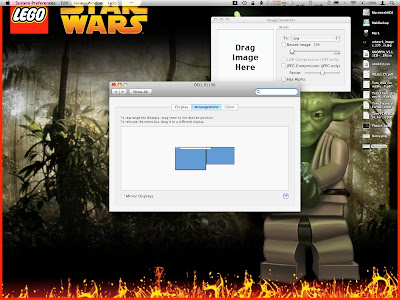
With this simple little trick, when I plug in my external monitor, the menu bar will move over to it. It does have the effect of making it the default display, to a point. Let me explain.
My external monitor is a 22" CRT. I know, I'm a little outdated, but what else am I going to use to hold my collection of Octopus plushes? Anyway, I would much rather use that as a default display than my teeny little 13" macbook display with washed out colors because of the rather poor backlighting scheme. I've been using my macbook with the external monitor for almost 2 years and never knew about this one simple little trick to make the external monitor act like a primary display. Simply go to display preferences, then the arrangement tab. This is so simple it's stupid. Just grab the menubar on the simulated macbook screen, a bold red outline will show up indicating which monitor it's active on. Then drag it over to the external monitor. Once the red outline is around the simulated external monitor, drop the menubar and voila, it is now your default display while it is connected.
This is not 100% perfect. When you go to mirroring mode, then the laptop screen becomes primary again. However, leave mirroring and all is back to normal. This is one of the best features of Mac, the ability to remember a monitor or projector and the last configuration used with it. Now, every time I connect my external monitor, I won't have to fiddle with anything, it will just be considered the primary.
I have one other little tip. Sometimes you don't want the laptop monitor on at all, whether it's spanned or mirrored, especially if you want to watch a movie on the larger screen. Well, you could dim the backlight completely, but your desktop is still spanned and that could be inconvenient at times. However, there is a way to trick the computer into thinking you only one display, the external one. To do this, make sure you are using both displays, set the display preferences to mirroring. The laptop will then act as primary display. Now, close the lid and let the computer go to sleep. Once asleep, use an external keyboard, plug in a mouse, or use the remote to bring up front row. The Apple logo on your laptop will flash then turn off, indicating the computer is no longer sleeping and did not find the built in display. At this point you can open the lid again and type and everything without the internal display on. It's kind of a hack to do it this way, but Apple never did build in a method to turn off the laptop display from within the OS, so you have to trick the hardware.
With this method, you can leave the lid closed and use the included remote to watch movies or play music without the need for a mouse or keyboard. But, if you happen to have a bluetooth or USB set, then they will function just fine.
Also, this is important for full screen applications that don't like to use anything other than the primary, ahem (Aperture). Now you can do your full screen editing on the big monitor. Is this cool or what?
[EDIT]
Aperture 2.0 fixes most of my previous complaints and functions with dual monitors wonderfully now!
Also, one minor problem occurs when I connect or disconnect the external monitor. Typically, the dock gets messed up. Part of that is because I have an unconventional dock, it is on the left and weighted to the top instead of center. When I disconnect the monitor, everything moves to the laptop display and sometimes the dock icons are moved around. Try to click on one and you might actually click on another. The fix is simple, run terminal and killall Dock. I have a script in the scripts menu to do it, and a keyboard shortcut using Global Hotkey which I'll talk about at another time.
Apple Feedback
With this simple little trick, when I plug in my external monitor, the menu bar will move over to it. It does have the effect of making it the default display, to a point. Let me explain.
My external monitor is a 22" CRT. I know, I'm a little outdated, but what else am I going to use to hold my collection of Octopus plushes? Anyway, I would much rather use that as a default display than my teeny little 13" macbook display with washed out colors because of the rather poor backlighting scheme. I've been using my macbook with the external monitor for almost 2 years and never knew about this one simple little trick to make the external monitor act like a primary display. Simply go to display preferences, then the arrangement tab. This is so simple it's stupid. Just grab the menubar on the simulated macbook screen, a bold red outline will show up indicating which monitor it's active on. Then drag it over to the external monitor. Once the red outline is around the simulated external monitor, drop the menubar and voila, it is now your default display while it is connected.

This is not 100% perfect. When you go to mirroring mode, then the laptop screen becomes primary again. However, leave mirroring and all is back to normal. This is one of the best features of Mac, the ability to remember a monitor or projector and the last configuration used with it. Now, every time I connect my external monitor, I won't have to fiddle with anything, it will just be considered the primary.
I have one other little tip. Sometimes you don't want the laptop monitor on at all, whether it's spanned or mirrored, especially if you want to watch a movie on the larger screen. Well, you could dim the backlight completely, but your desktop is still spanned and that could be inconvenient at times. However, there is a way to trick the computer into thinking you only one display, the external one. To do this, make sure you are using both displays, set the display preferences to mirroring. The laptop will then act as primary display. Now, close the lid and let the computer go to sleep. Once asleep, use an external keyboard, plug in a mouse, or use the remote to bring up front row. The Apple logo on your laptop will flash then turn off, indicating the computer is no longer sleeping and did not find the built in display. At this point you can open the lid again and type and everything without the internal display on. It's kind of a hack to do it this way, but Apple never did build in a method to turn off the laptop display from within the OS, so you have to trick the hardware.
With this method, you can leave the lid closed and use the included remote to watch movies or play music without the need for a mouse or keyboard. But, if you happen to have a bluetooth or USB set, then they will function just fine.
Also, this is important for full screen applications that don't like to use anything other than the primary, ahem (Aperture). Now you can do your full screen editing on the big monitor. Is this cool or what?
[EDIT]
Aperture 2.0 fixes most of my previous complaints and functions with dual monitors wonderfully now!
Also, one minor problem occurs when I connect or disconnect the external monitor. Typically, the dock gets messed up. Part of that is because I have an unconventional dock, it is on the left and weighted to the top instead of center. When I disconnect the monitor, everything moves to the laptop display and sometimes the dock icons are moved around. Try to click on one and you might actually click on another. The fix is simple, run terminal and killall Dock. I have a script in the scripts menu to do it, and a keyboard shortcut using Global Hotkey which I'll talk about at another time.
Apple Feedback
Friday, February 8, 2008
I only want one update to the menubar...
I've said it before, I don't mind, nay, I even like the semi-transparent menubar. Not once have I ever had difficulty reading the menus regardless of what background I'm using. That said, where I really think they need to improve is on what's visible in the menubar. I have a lot of little things running up there, as I add more, they become hidden by the menu of the frontmost application. I think that is horribly annoying. What I'd like to see is the objects in the menubar, particularly text, gets reduced so that everything can fit. Hell, I'd even be good with multiple lines provided it didn't increase the height of the menubar too much. Besides, there appears to be work arounds for most of the problems people find in Leopard, why not this?
[EDIT]
A Macbook Pro has a decent video card installed, such that using an external monitor at a high resolution would cause the menubar to scale down and allow everything to fit. Unfortunately, I don't have a Macbook pro, only the regular Macbook with the lame Intel GPU.
If you agree, please click on the apple feedback link and let apple know.
Apple Feedback
Wednesday, January 23, 2008
iPhoto '08 Vs. Aperture 1.5.1 Vs. Lightroom 1.3
After a while, one begins to wonder if there is something a little better than iPhoto. I, for one, don't like the destructive image editing. Sure, you can still "Revert" back to the original file, but then you lose your edits. Or, you can make a duplicate of the image before editing, taking up more valuable space on your hard drive (which, incidentally is what happens when you edit an image so that every edited image is a duplicate taking up more space). Aperture and Lightroom fix these problems, but at what cost? We all love how iPhoto integrates with everything else, how you can send images to iWeb, a Printshop, Flickr, and Facebook with a few simple plug-ins. We love that you can manipulate files with applescript and Automator. So, can Aperture or Lightroom hold a candle to iPhoto in these other categories? We'll find out in my comparison of the two.
One thing I should point out is that I'm not a professional photographer, nor am I particularly knowledgeable about Photo related software. So, there will be a time that I'll mention something I have no personal experience in, but have heard from others about. For example, it is my understanding that iPhoto has very rudimentary RAW file support, where Aperture and especially Lightroom excel in that area. This is mere heresay, but I believe it to be true.
When I first started with Mac OS, I was introduced to iLife '06, wherein lied iPhoto '06. I liked it quite well, it handled photo and video, could import directly from my Kodak digital camera, and the best part was all the free software or plug-ins that were available for it. Not to mention, it was completely scriptable and there were many actions available in Automator. When I saw the updates in iPhoto '08, I couldn't wait to get it. I really wanted the Events feature that would automatically put photos in categorized events based on the date and time the images were taken. It seemed perfect. However... It has become quite the maintenance hog to keep Events organized. For example, I like to keep all my downloaded images, particularly wallpaper, in iPhoto. Each wallpaper has a specific date of creation and that usually generates it's own event. So, for every single item I import that isn't from my camera, I have to manually adjust it. Plus, even those that are from my camera, I have to adjust into individual events. It isn't hard, but kind of takes away from the idea that the feature operates automatically as Apple would have you believe. One of the key improvements, and my favorite feature, is the keywords addition. Not only can you add keywords to a photo for sorting and smart folders, but you can now assign keystrokes to a large number of those keywords to automatically assign or de-assign a keyword to a photo or group of photos. I absolutely love this feature and it may be the one reason I keep iPhoto around. Especially since I like low maintenance folders, thus I like smart folders that I can base on keyword assignments.
Aperture does have smart folders, but I feel as if the capability is weak and even a step backward compared to iPhoto '08. In iPhoto, Apple improved search features a little bit, enough so that you could suggest a search that simply excluded things. Aperture only allows for searches that contain or are equal to a term, there is nothing about excluding terms. However, Aperture has a lot more that it can search through such as full metadata, and a much larger list of professional keywords built in. I've seen no option in Lightroom for smart folders, although it does have a powerful search function. Both have keywords, but they can't be assigned via quick keystrokes. However, they are still fairly easy to modify.
Aperture is fully scriptable and comes with automator actions that are automatically installed with the program. Lightroom may be scriptable, but it did not come with any actions. Also, the Aperture library is integrated in the media browser like all iLife applications. Lightroom stands alone. One feature I like in iPhoto is the ability to set a particular image as the desktop background. Aperture doesn't have a button like that, neither does Lightroom, presumably because that is not really a feature that professional photographers need. Still, the Aperture library is available when you want to change your desktop background the old fashioned way, where Lightroom isn't available at all unless you export an image. However, both iPhoto and Aperture use a proprietary package to store the library. Lightroom uses a catalog type file, but all the original images are available in their respective folders. However, the same can be said with Aperture, which now has the ability to keep the masters anywhere and store in it's proprietary format the modified thumbnail images. iPhoto is the only one of the three that can't get information if the full library isn't there.
Speaking of integration, in iPhoto and Aperture, you can drag a photo to the desktop or a folder and it will be the exact image you thought you grabbed. In Lightroom, it copies the referenced master image, not the one with your edits. So you explicitly have to export to get your edited image available outside of Lightroom.
One key plus to Lightroom is that it is the only one of the three that can edit EXIF metadata. That was my main purpose in looking at it because I have some images whose EXIF data is messed up. iPhoto can't really edit much. Aperture is great on everything except EXIF. The funny part, the EXIF data I wanted to modify in Lightroom, doesn't even show up. I have images whose EXIF data is incorrect, as shown in Aperture, but bringing those images into Lightroom reveals that the date isn't even in the EXIF data. How can that be? I suppose that the nature of EXIF data is that it is supposed to be a perfect record of the camera, aperture, ISO speed, date, and time that an image was taken. Which means that it never really has to be modified. But then, i have to wonder what put the data there in the first place because those images were taken with a film camera. Regardless, Aperture sorted by date as a default and didn't seem to care about the actual date that I put in the IPTC data.
Aperture looks as though an entirely different team of people, completely unrelated to iLife or even the current state of Mac OS, were designing it. That said, it also looks and feels much more professional. There are many more menu options, many ways to view the screen, and many ways to adjust stacks. After playing around with stacks for a bit and finding a few preferences related to it, it's not entirely different from the events in iPhoto. Although, a stack is merely a set of images modified from the original, not a collection of images from a particular photo shoot. And then, while Events are pretty neat, they are just fancy looking folders for your images. In the more professional sense, it's easier to look at folders and simpler to maintain them.
Lightroom has by far the best overall appearance. It has an elegant and beautiful black design. I like the way menus and features can be hidden, but Aperture does some of that. It is definitely professional photo software, but it is also more daunting than Aperture. The lack of smart folders is disappointing and pretty much a deal breaker for a novice like me.
Aperture has many interesting features as well. One of my favorites is non-destructive editing. In iPhoto, if you edit a photo, you are changing how it appears in iPhoto, and creating a new copy on your computer. In Aperture, when you edit a photo, you are only adding a set of commands to the photo. That is, it creates a file that references the original image and then adds commands to that to alter the image. Lightroom is extremely similar to this. Those commands can be anything, including cropping. Now you have the original image and a copy of it, where the copy only takes up mere kilobytes of spaces compared to a complete copy of the image which would take up megabytes. Plus, you can have multiple copies, each only taking up a small footprint of space. I just love this feature and think it is the best thing, especially since I can see the original file at the same time as the new file. Aperture creates "stacks" for modified photos, you can expand them and see all the different mods you've put to an image. However, this is one area where Lightroom really shines. While it doesn't have stacks, you can easily create a new virtual copy of an image, although I didn't find an option to create one from the original. When editing a copy, you have a full and entire history of edits. If you scroll the mouse over them, it shows the results of edits to that point in a small window above. This makes it easy to go back a few steps, or even tens of steps if you just don't like where you were going with the edits. Also, there is a very cool feature that lets you view the old and new side by side, one over the other, or even a split view showing half the image in old and half in new. I really really like this ability to compare to the image you were modifying.
Aperture looks professional, but not so much as to be intimidating. It still has buttons for iWeb and such, but lacks the large pretty icons that iPhoto has. Also, the screen is divided a little different. iPhoto has an interesting way of editing images where you can go to full screen, a panel pops up on the bottom on mouse over, as well as on the top. Aperture does this as well, and the fact that you are only creating a small file with commands to alter the original, without actually doing so, makes this one of the most valuable features for a person who modifies their photos a lot. Lightroom has buttons for email and web, but again it isn't well integrated in iLife.
Once you get to know aperture, you really get to liking it. However, what are its major limitations? Well, after researching, I think there are even less than in iPhoto. http://www.aperturepluggedin.com/plugins/ this takes you to a current list of Aperture plug-ins. I've already found the Flickr and Facebook ones, plus it offers SmugMug for you professional photographers out there. Lightroom also has a few plug-ins, including facebook. The biggest problem in Aperture is it is a little more difficult to start using in comparison to iPhoto, but not as much as Lightroom. I don't really like the full screen mode, where in iPhoto it's easy in, easy out and used the same monitor that iPhoto was running on. Aperture chose my small laptop screen to run on, even though the program was running on the 22" desktop screen. I'm sure there is a way to fix that, but a new user might get frustrated with all the features trying to get it to work, especially when iPhoto did it right away. Lightroom did the same thing though and it is supposed to be dual monitor compatible. That said, I really like Aperture now. Just knowing there are tons of plug-ins, non-destructive editing, and integrates well into Mac OS. Plus, it comes with some automator actions and is fully applescriptable. Even for a novice point and shoot kind of guy, I like the powerful features. And since I'm also a computer guy who likes to save space where possible, the image editing is nearly a priceless feature.
The real question is whether or not I continue to use iPhoto. It's simplicity might be nice, but once I get fully accustomed to Aperture, would I ever really find a need for it? Only time will tell. Oh, and I didn't forget about Lightroom. My opinion on it is that it's lack of integration, lack of smart folders, and confusing editing options make the program more suited to Windows than Mac, and more suited to Adobe users. It has a beautiful interface and can edit some EXIF data, but that's about it. The only other reason I would ever use it is that it is more likely to be able to share the same catalog with windows machines, but I can't even say that for sure. For dedicated Mac users who are used to the Mac way of doing things, Aperture comes much closer than Lightroom. iPhoto is best in this category, but it simply can't hold up to the features offered in the other two. That said, I proclaim Aperture the hands down winner, with a little compromise.
Apple Feedback
Monday, January 14, 2008
Spotlight needs help
I love Leopard now. I never minded the transparent menu bar, and there are so many easy ways to make the dock more attractive and useful that it is no longer an issue. But... I do have a big problem with the new changes in spotlight.
In tiger, you could use command-space to bring up spotlight and search quickly for any file, folder, application, that you wanted. You can still do that in Leopard. In Tiger, you could option-command-space to do the same search, only it would show all entries in a new window which was consistent, not requiring the mouse over it to remain in place. From here you could select one or multiple files to show in finder and open their containing folders. I used this feature extensively to remove programs, as most programs create 2 or three additional files on the system. Also, when you set preferences for spotlight, such as not showing webpages or music files, it would honor that. No longer is this the case in Leopard.
In Leopard, you can set your spotlight preferences, and your searches will ignore those items you unchecked, until you opt to show all. Then, without any regard to your preferences, a list of everything on your computer shows up in finder. I don't like this finder integration. If it were at least similar to the old spotlight window, where items were at least categorized and it was easy to ignore those you don't care about, then that would be okay. But instead, the new setup uses finder, and includes all files that match your search criteria.
However, after using it a bit more, I can see the power that hides beneath. First, I can limit my search very easily to just my home folder instead of to the entire computer. This cuts out a lot of crap. Second, I can sort by type and scroll past that which I don't need. The downside is I have the developer tools installed and most searches bring up hundreds of C libraries. That is quite annoying. I still miss the old spotlight window where I can expand or contract the list of files of a particular type. Plus, I could choose to see a subset or all. It was really quite nice and I liked it. The gain in the new setup is being able to instantly delete the files. But I was okay with finding the files first, selecting those I wanted to delete, then opening their containing folders and doing the delete. That worked for me. This new method integrates spotlight and finder a little too much and I'm not sure I like what has been improved enough to warrant the change.
Apple Feedback
Subscribe to:
Posts (Atom)