I knew it wouldn't be long before someone created a full-blown application, cocoa support and all, just to change the Dock. The program is called PimpMyDock and seems okay, although a little confusing at first. Plus, it is in need of several features to force it to replace my custom workflows. For one, it allows you to create a theme from a folder. This is nice because most of what you download at leopardocks is nothing more than a folder containing image files. But, where this becomes cumbersome is you have to individually import each folder which requires telling the program where to store the theme file each time. This could be improved. But another feature that my simple scripts will never have is the ability to view the image files before selecting the theme. Also, this program allows you to modify the theme by dragging new images into it and saving it as a new theme file. It really is the best option for those who don't want to deal with Applescript and Automator especially considering that Leopard has only been out a short time. I have no doubts that the program will improve a great deal over time and because of the extension the author applied, I feel it will actually become a standard in Leopard Dock themes.
Recently I installed Electric Sheep on my macbook. If you're not familiar with the program, it is a screensaver that is adaptive. It's designed to propagate only the best images. Random screen effects are displayed and you can vote by hitting the up or down arrows. This basically sends a screenshot to a server and based on popularity the computer decides whether to foster or kill the design. You can even design your own images to start with, upload them, and if they are popular you will see their resemblance in new offspring. Anyway, I also use a program called Backlight 2 that can take any screensaver and run it on my desktop as background. Sure, it can be kind of distracting, but it's really impressive looking, especially to Windows users. Backlight has a really cool preference, simple as it may be, you can set the opacity of the screensaver so that your desktop background can be partially seen. I have a large collection of Apple icon wallpapers and have Electric Sheep run at 50% over some of them is quite cool looking. I want to be able to save some of these images to use as wallpaper in the future, but how? Well, I have yet to figure out an easy way that doesn't involve downloading another app. I'm tired of downloading apps for what I think I could do in an applescript or built-in software, but alas there is nothing so far that can do exactly what I want. Let me explain...
Apple provides several screenshot options. The most obvious are the shift-command-3 and shift-command-4 which takes a full-screen screen shot and a selection respectively. But, did you know that you can shift-command-4 hover the mouse over a window, dock, menubar or desktop itself and hit the spacebar, it will highlight the entire item. This is really sweet and I wish I knew about it a few days ago when I was taking screenshots for this blog. However, the one and only disappointment is that it doesn't work with backlight. When I try to get the screen capture of the desktop while backlight is running, it is the correct image only it is washed out due to the opacity setting. Plus, when screensaver is active, any keystroke exits before you can take the screenshot. Not that it matters because I want the apple logo behind the sheep. I have figured out how to put Finder in Kiosk mode, (see the image) but I haven't figured out how to script it. It requires the modification of Finder.app->info.plist file and I can't seem to find a convenient way to script that change. It requires adding a key and deleting it, even though changing the value is supposed to work, it never did for me. But, if I can learn how to get Applescript to edit the info.plist file of the current application, I can turn Kiosk mode on and off at will. I really want something this simple because I feel that there are many apps which would be best served to run in Kiosk mode; The Gimp, Photoshop (although the builtin functions are quite adequate), iPhoto, X11. In fact, turning off the dock for most things might be good, after all, it isn't gone for good and I use command-tab plus quicksilver to do most of my work. So, finding an easy way to modify that key would be great.
After a few hours of work (yeah, I seem to have that kind of time right now), I've figured out a way to do this. It isn't pretty, but none of my scripts ever are. Plus, it does not work on Finder. I'm sure with a bit more research I can get it to either use a Finder alias or to authenticate to allow the change, but directly it does not yet work. However, this works perfectly for every other normal application. First, it asks you to search for a .app file. Then it does some testing to see if the key in the info.plist file is there. If the key is not, it puts one in at a default value of 0. Then it evaluates the value of the key, if it is 0 it will change to 4, and vice versa. Lastly, for any application that happens to be running when this occurs, it does a killall on it. That part doesn't always work so you're best to not have the application open when running this. But, for the most part it does what I wanted. Now I can turn the Kiosk mode on or off for any application. I would like to polish it eventually so that it could work on the current open application, but I doubt I'm going to go that far with it. Take note of one thing if you decide to do this, do not enter the name of the plist file as info.plist. Follow my script exactly and enter it as info only.
Apple Feedback
This originally began as a blog for all things Mac, but then I defected and went back to Windows. I want to write more, so now I've renamed the blog and opened it up to just any ol' topic I want, mostly of the technical nature. I just want to throw my limited knowledge out there in the hopes that it makes someone's life easier :)
Sunday, December 2, 2007
Saturday, December 1, 2007
Corrections to Automator Post
A week or two ago, I posted a suggestion on how to change the Dock background. I then commented on that blog about how it doesn't work right. Well, I have finally figured out a few things on how to make it work properly. First, the attached link takes you to a page with many new Dock designs to download for free. There is even an app to help change the Dock, but I had problems with it and so I still had to write my own. What I discovered is that even though you can use shell scripts, you can't use sudo. And if you don't have permission to make the change and are never prompted for a password, the shell script simply exits without making all the changes. So, I had to rethink my method of changing the dock. Plus, I didn't want to have to write a script for every single new Dock background I wanted. So, I developed a slightly longer version that asks you where the files are. This also allowed me to incorporate some other features such as changing just the separator or just the indicators. Thus, I now have 4 scripts to change the Dock as follows:
ModifyDockIndicators
ModifyDockSeparator
ModifyDockTheme
RestoreOriginalDock
I think these are all fairly self explanatory. The idea is that ModifyDockTheme will copy all .png files from a folder and replace them in Dock.app. So you could have a veritable theme with total customization of the Dock. I did not include a ModifyDockBackground script because I figure I'd use the theme more and if I wanted to I could simply use the other scripts to change the indicators or separator to what I want.
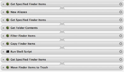
Here is a screenshot for Restoring the Dock. This is one is particularly important because I run it in all the other scripts so as to always start from the original.
I minimized all the scripts because the titles are most important. The first step gets the resources folder in Dock.app. It creates an alias to it on the desktop. This is extremely important because for some reason the finder scripts in Automator don't allow access to protected folders. By doing this the alias doesn't seem to be protected. Also notice that some of these scripts don't have arrows connecting them. If you aren't familiar with Automator, you can right-click on the title and tell it to ignore input. This is also important and handy to keep Automator from getting confused. Next I tell it to get specified finder items, this is the folder that contains my backup of the original Dock. The next line gets the contents of that folder, then I filter it by .png, and finally copy them to the alias on the desktop. Be sure to tell the copy command to overwrite existing files. The shell script only does one thing, killall Dock. Lastly, I get the alias and move it to the trash to clean up my desktop.
Now, I'm not entirely sure why this works where the last one fails. It never asks me for a password to make the change. But it has been flawless ever since I wrote it. Now, save this script as an app. Keep it in a location where you keep all your apps and never move it or your other scripts will be broken.
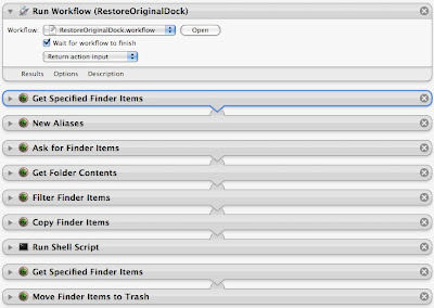
Next is a screenshot for modifying the Dock theme. You don't have to have a theme really, but this script filters all .png files in the folder of your choice, so if you only have the 4 scurve files, those will get copied. But if you have a full-blown them, all .png files will get copied. Here's how it goes.
The first step uses the restore script to bring the Dock back to factory specs. For the theme script, I chose to do this all the time so we don't get a mixture of themes. I follow all the same steps as before, only this time you'll notice that I ask for finder items. This will prompt you to pick a folder containing .png files for the Dock. It will filter all .png files, copy them into the alias, restart the Dock and delete the alias, just as before. Pretty simple huh.
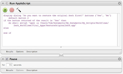
Lastly, you may want to change only the separator or only the indicators. It is the same script as above except I've included an applescript to prompt whether or not you want to restore the Dock first. The pause is important because sometimes it doesn't perform the operation fast enough and you end up with two aliases on the desktop, then it only deletes the one. So be sure to include the pause for proper cleanup. Also, there is one other key thing. When you filter you have to put in indicator for the indicator script, or separator for the separator script. Since the only files in a Dock theme that contain those names are .png, it is safe not to look specifically for an image file.
I've placed all of these in a folder where I keep all my custom designed workflows and apps. I created an alias to that folder and placed it in my scripts folder so it'll show up in my scripts menu. I did this because I was tired of trying to keep track of all the copies of scripts I have and where they are stored. So now I create aliases to the original location and place the aliases in scripts or finder plugins. This keeps all my scripts in my Documents folder under Scripts where I can keep a very organized hierarchy as well as keep them in a consistent place and never move them, ensuring that they always work.
As a last comment to all of this, you can see how running three scripts could create a custom them. You can run the ModifyDockTheme script to change the overall appearance, then run the Indicator and Separator scripts to alter those to your liking. And guess what, it doesn't take much effort to see that all you have to do to save your custom theme is write another automator script to filter the .png files from the resources folder and copy them to a new folder of your choice of name. You can have an endless supply of personal themes.
I hope you've enjoyed this Automator and Dock changing tutorial, and I apologize for the misinformation from before.
Apple Feedback
X11 was lost, but now is found
For my lab work I use X11 all the time. I have to connect to school via ssh and run a custom program designed by CERN to analyze data from proton-proton collisions. When I installed Leopard the first time I didn't do an upgrade, after having read some disturbing issues with that. So I opted to use the migration assistant and install all my data from a smart disc image created by SuperDuper! That did work, and most things seemed to work after that, including X11. There were some problems, however, including more space taken up than I thought should be. So I reinstalled Leopard and manually brought my files and some programs over. It was a smart move on the behalf of disc space, I saved over 20 GB by doing this. That's how much unused junk I had on my system. Anyway, this didn't come without its costs though. X11 was barely functioning. Part of the problem is I didn't know what I was doing. I configured X11 for Tiger once, at the beginning of Summer, so I didn't remember a thing about what I read or how to do it.
Apple made several changes to X, including changing from Xfree86 to X.org or something like that. It turns out that if you keep your old .xinitrc and .bash_profile you will experience problems. X launches in a whole new way now. There are also two physical instances of X11.app on the system. I'm still confused by that, but now I don't care. You also should NOT run X at startup. One of the key features is that unlike Tiger, you can now click an X application and X will launch on it's own without having to be previously opened. That was a huge improvement. But it just didn't seem to work right. My connections would work for a little bit, then suddenly I'd get errors and nothing would work. No windows from the remote machine, and therefore no work done. I was getting rather upset by this because I wanted Leopard so bad, but didn't count on it breaking my connection to work.
This is when I decided to remove all instances of X11. I figured that somehow, some Tiger configuration got mixed in with Leopard and the whole thing was broken. Here are some steps I took to remove it. Type these commands in Terminal.
sudo mv /usr/X11 /tmp/
sudo rm /System/Library/LaunchAgents/org.x.X11.plist
sudo rm /Library/Receipts/X11User.pkg
sudo pkgutil --forget com.apple.pkg.X11User
Above instructions obtained from: http://aaroniba.net/articles/x11-leopard.html
I also added a few steps of my own which included a manual search for X11.app to ensure all copies got removed, those that didn't I deleted manually. Plus, I removed all instances of X11 preferences. I wanted no trace. Lastly, I knew that .xinitrc was a problem, so I renamed it and commented out the line in .bash_profile as follows:
#export DISPLAY=:"0.0"
Then, I reinstalled X11 from the optional installs folder on my Leopard disc. But before running it I restarted just to make sure everything was sound. (I know, this is proof that I was once solely a Windows user.) And still, before running X, I found this awesome update utility that would fix many of the current bugs. For some reason, Apple isn't releasing updates for X in a timely manner. They probably figure that they'll get it right first, but in the meantime we have to suffer. Fortunately, there are some bright people out there and X11 is being updated with many beta packages. To finally fix X, run these two commands from Terminal.app.
curl -LO http://people.freedesktop.org/~jeremyhu/x11-apple/x11_update.sh
sudo sh x11_update.sh
This was obtained from: http://www.x.org/wiki/XDarwin
What this will do is search for packages that need to be updated, download and install the updates. Ever since doing this, X has worked perfectly, it even shows up on my second monitor which was broken originally. Granted, these are not necessarily stable packages, but I trust these guys to get it right. If something doesn't work, you can bet they'll have a fix for it within a day and that's a damn sight better than Apple right now. I plan to run this script frequently and get myself on a mailing list so I know when updates are available. Thank you Jeremy, this has enriched my life!
[EDIT]
The above steps have been discontinued due to, I guess, different support of the Xquartz project. This link, http://forums.macosxhints.com/showthread.php?t=80171, tells you a bit about it and has links to the new source for X11 updates. It works just as well, if not better than Jeremy's solution, but his no longer works. These updates have been quite regular and have allowed my system to become more and more stable. Now, GIMP rarely crashes X11, and I can only imagine it will get better.
Apple Feedback
Tuesday, November 20, 2007
Automator is much improved
It's funny that after all I've read about the new improvements to Leopard, no one has mentioned the new additions to Automator. Well, maybe they don't use it that often, but for a person who is by far more comfortable with scripting than programming, I think Automator makes my life exceedingly easy.
I can say that there are still things you can't do in 'Otto', but most things are now possible with the addition of Terminal commands. It is very easy to create a simple workflow or app to click on to run something you would normally have to type in the terminal to do. Not to mention, it makes hard to remember steps quite easy. For example, it has been circulating the internet that everyone hates the new 3D dock. And I must say, I used someone else's trick to change it to the 2D version for a little while, until I learned that I could change the color of the shelf. But it doesn't stop there. I can add textures, make it shinier, bolder, subtler, whatever I want. The hard part is changing the files each time I want a new look. Enter Automator. I have quickly and easily made it possible to change my dock shelf with a simple click on a workflow, choose my color and voila, a new and improved dock. Let me show you how I did it.
First, you have to modify the image or png files. These are all located in System/Library/CoreServices/Dock.app,
You'll have to right or command click and choose 'Show Package Contents'. Then navigate to /Contents/Resources
Here there are 4 files all beginning with Scurve-x.png, where x is either l, m, xl, s.
This one is simply Red
Apple Feedback
I can say that there are still things you can't do in 'Otto', but most things are now possible with the addition of Terminal commands. It is very easy to create a simple workflow or app to click on to run something you would normally have to type in the terminal to do. Not to mention, it makes hard to remember steps quite easy. For example, it has been circulating the internet that everyone hates the new 3D dock. And I must say, I used someone else's trick to change it to the 2D version for a little while, until I learned that I could change the color of the shelf. But it doesn't stop there. I can add textures, make it shinier, bolder, subtler, whatever I want. The hard part is changing the files each time I want a new look. Enter Automator. I have quickly and easily made it possible to change my dock shelf with a simple click on a workflow, choose my color and voila, a new and improved dock. Let me show you how I did it.
First, you have to modify the image or png files. These are all located in System/Library/CoreServices/Dock.app,
You'll have to right or command click and choose 'Show Package Contents'. Then navigate to /Contents/Resources
Here there are 4 files all beginning with Scurve-x.png, where x is either l, m, xl, s.
Copy these files. I chose to make a folder where I keep all my modified system images, I called it DockColors, and it contains subfolders for each new set of images I render in different colors. Right now I have several which I'd like to show.
This one is simply Red
This one I call Charcoal
This one I call Cement
This one I call Sumi
This one I call Cement
This one I call Sumi
Okay, now that I've shown off, let me explain how Automator helped me to make this change as simple as clicking on a workflow.
First, start your copy of Automator and drag to it "Run Shell Script" from the Utilities menu. Type the following in for the script making changes to paths as necessary.
cd /Users/z_evil_genius/Pictures/MyArt/ModifiedSystemImages/DockScurve
cp -fR Sumi-e/ /Volumes/Macintosh\ HD2/System/Library/CoreServices/Dock.app/Contents/Resources/
killall Dock
Save it as a workflow with a meaningful name to tell you the color, I chose to put it in a folder called Dock Color Scripts and put that in my Scripts folder. The first line changes the current working directory to one that has all your subfolders containing copies of the Scurve files.
Notice in the second command I have 'cp -fR Sumi-e/', This is copying the contents of the folder Sumi-e which contains copies of the Scurve image files. This also means that you'll need to change this name to the folder you created to house the image files. For example, I called my Red one Blood (even if it isn't quite the right color yet) and so to copy my red Scurve files I would type cp -fR Blood/
The last line obviously restarts the dock.
For every new set of colors you'll want to create a new script like this and a new folder to store the Scurve files. Now, this script is runable as is. Just go to your scripts folder and open the new folder Dock Color Scripts, click on your new color and watch the magic.
I certainly hope this helps you to appreciate the power of Automator as well as learn a new trick to making that hard to see dock look much better.
Apple Feedback
Tuesday, November 13, 2007
A note about Letterbox for Mail
Letterbox is a great hack for Apple's Mail. I complained about the lack of options to change the view for Mail from the typical Outlook format to something a little more widescreen friendly. Enter, Letterbox. It is a hack that rearranges the panes so that the message pane is all the way to the right and full screen top to bottom. I liked it a lot for my widescreen macbook. But... After using it for many months, maybe even a full year, I am back to the old style. Why? Well, it seems that after fiddling with smart folders and filters, I've managed to get everything set up in such a way that I don't need a huge long list of emails to show up. Plus, I get mail from Apple, Amazon, and Tiger that all use html and the three vertical pane view just doesn't cut it. I guess the Apple designers who didn't offer the option knew why it wouldn't be necessary. But still, is it that hard to add one additional interface, a slight tweak to the existing one? I mean, they could offer it, knowing it might be inferior for MOST of their users, but still make ALL users happy. So, I've included a link to Letterbox if you are one of those people that prefer 3 vertical panes. And it would work even better on a larger screen, like that of a macbook pro.
Don't let me confuse you, I sound like I'm on a rampage complaining about Apple, but I'm nowhere near that. Considering all the mistakes that microsoft has done, Apple is awesome. But, they do seem to be slacking lately with lack of customizabilty. Leapard is a good example, but since I don't own it yet I will refrain from making any comments.
Apple Feedback
Apple Feedback
Sunday, November 11, 2007
It's almost here!
I am waiting patiently for my copy of Leopard to arrive, which should be today or tomorrow. I've read tons on it, some good, some bad, but I have a plan. I will not, repeat: WILL NOT upgrade. As tempting as it is to not have to reinstall all my applications and import mail, address book, and keychain items, no good can come from an upgrade. I use X11 rather frequently, particularly for work where I need to access linux systems remotely and run GUI programs. Yet, I've heard that an upgrade to Leopard breaks all X apps. So, at the risk of spending days getting my computer back up to speed, I will be grateful to have a clean install.
I've taken steps to ensure that the most important programs get installed early. I've listed all programs that run on startup that I use, all dock items (I only put the most important of apps there), preference panes I've installed, and Software I've actually paid for. These are the things I will restore first. Next I'll restore my unix environment by importing config files such as .xinitrc and .bash_profile. I've also started a list of applications that I know are Leopard ready. Lastly, I'm the type of computer user who likes to mess with sensitive aspects of the system without taking many precautions.
Apple Feedback
Apple Feedback
Wednesday, October 10, 2007
Quicksilver
I love quicksilver. There is no better productivity program out there than one which lets you open programs, files, folders, scripts, etc without the need to point and click.
What is Quicksilver you might ask? Well, it is similar to spotlight in that you can hit a combination of keys to bring up a window to type in. As you type it finds things for you. It has a load of options to customize how it searches, what it searches, and how you deal with it. I can say that I haven't even come close to using all of it's features. I mostly use it for opening applications, which is a severe underuse of the program. But, the more I use it, the more I do with it. For instance, it has triggers. I can assign keystrokes to perform certain actions in the system. One I use all the time is iTunes triggers. I can pause, rate, skip and other commands with the keyboard alone. No mouse is required to do these things, no switching of windows. If I don't want to hear a song I hit my set of keys and it's on to the next and I haven't left my current application.
The program is adaptive, so it can learn from what you type and what you select. The next time type part of the name of a program or file, the one you repeatedly select will become the default. But, because of all that it can do, it also suffers from memory leakage. When used often and completely it must index everything, including it's own database of memorized keystrokes. If you don't restart the program or your computer frequently, it can easily eat up a lot of RAM. This does tend to be a problem for me as I rarely restart my laptop. I wouldn't mind having a scheduled script to close and reopen quicksilver for me, that might be something I could work on. Otherwise, the program is awesome and is the most useful program you can put on your computer. It's even better than trying to find a replacement for finder. It's absolutely free so download a copy today!
Apple Feedback
Apple Feedback
Growl
I installed Growl for the second or third time since I've had my Mac. The first two times I never saw what was so special about it. This last time, I actually installed many of the plug-ins, particularly the Mail plug-in. I'm still kind of mixed on it, but I think I like it enough to keep it. First, Growl pops up when events in the system occur. For Mail, this means whenever I receive email I see a popup. It doesn't steal the focus of the mouse or keyboard, so it's fairly non-intrusive. There is one interesting feature called Sticky Notifications. While I'm active on the computer, a notification will show for a moment. The time frame that it stays up seems to vary with how long I stop doing what I'm doing to read the notification. If I barely stop at all, the notification seems to disappear quickly. But, when the computer is idle, all notifications stay. This is nice if I leave for dinner or something. When I get back, there's usually several notifications to tell me what's going on. This can be good, or this can be bad, depending on how you look at it. One thing I'd like is a clear all option. The problem with Sticky Notifications is that once they are stuck, you have to individually click on the x to close each one. But it is nice to see part of an email to know if it's important or not, as opposed to Mail's new mail indicator which only shows how many new mails, not from whom they are from. This means that you have to be curious enough to open Mail and look. I'm not so curious and have a tendency to just ignore them thinking it might be junk mail. With Sticky Notifications, I see what has arrived and if it is of particular interest then I can click on the notification itself and the email will open. I like that feature a lot. There are also no questions about whether a file has downloaded or not. I like to close the Safari or Firefox download window, but I never receive any notification when the download is complete except to find the download window again or try the file. But Growl saves me there as well by letting me know the instant the download is complete. There appears to be Growl extensions for all your favorite programs, including Adium, Safari, Firefox, SuperDuper!, and many many more. Maybe you wouldn't want to have a pop-up everytime something happens, but I kind of like being fully informed and think Growl is a wonderful program and well worth the price of FREE.
[EDIT] As of 3/19/08, Growl still doesn't want to run on Leopard. It runs, but nothing ever happens, despite the fact that the designers say that it works. GrowlMail, my favorite feature of Growl, doesn't run at all. Again, they indicate that upgrades have been made and it should run, but I've never been warned of any new mail. GrowlTunes has failed to show me a single pop-up when a song changes. I have no idea what's wrong, but I've uninstalled and reinstalled many times to no avail.
Apple Feedback
Saturday, September 29, 2007
Various subjects
I've been messing around with my system a lot lately. Mostly because I had some issues last night whilst I was trying to upload some homework. For whatever reason, my system seemed to hang badly. Firefox wouldn't do anything, and I had bouts where finder wouldn't respond either. Looking in to it, I discovered something interesting. I was downloading a torrent file, I won't say which one except to say that it was over 50GB large. That's right, 50! But the first one didn't connect, so I found a second torrent. Suddenly my system is sluggish. All the while, i'm trying to finish my last program and a plot to go with it and upload that to a folder before the deadline. It was already 2 days late. But Firefox behaved horribly during this time. But before I go into that, let me explain one thing to you people out there. If you are using Azureus, the java based torrent client, be prepared for it to automatically reserve hard disk space for the file you have elected to download. For me, I had a total of two files, each over 50GB in size. That left only about 3GB of free space for all other programs and processes to fight over. Not good. However, 3GB is a lot of space, and that was after what was taken in virtual memory, so theoretically it should have been fine. But Firefox had other things to say about that.
As I use Firefox more, I'm starting to see some more serious issues. For example, this stupid beachball problem. It's only browsing the web, how hard can that be? My cell phone can do that. But from time to time, Firefox just doesn't want to do anything . And yet, Safari is still limited. The beta release of Safari is okay, it improved on some things such as being able to display the rich text form of this entry box I'm using to add my blog for today. But it still doesn't support other things that both Firefox and Camino support. I still like Firefox, but my issue yesterday really angered me. And now I'm noticing other stupid little things. When I'm home I use an external monitor to widen my desktop. Obviously, my desktop monitor is much larger than my 13" macbook screen. So, naturally, I like to view my webpages on the large monitor. But Firefox 2.0.0.7 has made that very difficult. My bookmarks and anything else that brings up a menu (right-click), the menu shows up on my primary display. That is a seriously annoying bug. And I've heard others complain that Firefox only snaps to their main display and refuses to show on an alternate. I haven't had that problem yet, but the menu thing is annoying enough. I honestly don't know where I stand right now on the browser issue, which one do I like, which do I not like? I'm not sure anymore. I think I still like Firefox, but they have to fix these issues. Safari isn't being developed fast enough to make it worth while, and so I doubt I'll ever really like it enough to replace firefox. I can handle a slightly slower browser, but not an unresponsive one, and certainly not one that has issues with different types of content.
I've been playing around with different window managers for X11. I have many many ways to run programs on my Mac. I can use parallels to run most windows programs as well as any linux program. But... there is still that promise to get these things natively on Mac. Or, at least, native enough. Basically, parallels takes up too much space in both the installation and in memory usage. I'd much rather have X11 up and running to do all my linux work. This may be a mistake though, but it's something I'm willing to try out. However, I like and kind of miss Gnome. I have learned how to use different window managers and tried several, but the one I've always liked is gnome on metacity. So, I'm downloading that now to try to get it running. If it works half as well as in a typical linux distro, then I'll be a happy camper. However, this whole venture might be in vain for I'm still using Unix and every physics department in every university is using linux. It will be difficult to get every bit of software that I'll need to run on the mac natively or in X. I might simply be better off using parallels, which is fine, but not preferred. I think what I dislike the most about running linux in parallels is that it doesn't have a coherence mode like the windows versions. That is, running windows in parallels gives me the opportunity to drag and drop files and such that the linux version doesn't have. In fact, I have to quit linux first just to use a shared storage location. This is highly inconvenient. So, the more linux like I can make my mac, the better. If things work out I'll post a screenshot of gnome running in X11.
Apple Feedback
Saturday, September 15, 2007
iTunes: Much needed improvement all around
I had this to say to Apple today about iTunes...
I'm actually not interested in sharing my iTunes library with random people as I travel the planet, but what I am interested in is being able to manage my iTunes library from other computers in my household. My entire library is kept on my Macbook, the rest of the computers in my household are Windows systems. With that in place, I would like to be able to rate and change song info from any system that I choose. I think iTunes should have a password system set up so that I can create a username and password and login to my shared library to make changes rather than go find my computer and remember what song I wanted to rate or change. Also, I noticed a lack of info in the get info option when viewing my library from another computer. Why isn't album art displayed or lyrics? These last two are just little things, but personally, a music library is kind of a family affair and everyone (subject to rights I'd set) should be able to add to, modify, and even remove songs. Of course, having moderator type features would be nice as well, such as allowing the change, but recording it and flagging it so that iTunes on the serving system can ask the owner if all these changes are okay.
Also, another feature that I believe is highly requested is multiple search/sort criteria. Mostly in sort. I know that if you click the header multiple times you get different sorts, but it isn't clear what they are. You should have either a sort notifier to tell you, or better yet, the ability to get a list for each header and sort by it. That is, I might select year and tell it to sort ascending, then click album name and tell it to sort alphabetically, then artist alphabetically. Or something like that.
And one of the biggest most important changes I think iTunes needs is a current playlist like you get in winamp, yahoo music, or any other media player/manager. That is, I should be able to drag any song I feel like playing to a list on the right without changing the currently playing song and without having to build a permanent playlist first. And later, if I like what I built up, and after sorting it to be exactly the way I want, I can save it as a playlist.
Another weird thing is I have no idea what playlist I'm listening to as I browse through my library. I select a playlist, play a song and then browse elsewhere, then I've forgotten what playlist I'm listening to. Sure, I could double click and bring it up in a new window, but then this most annoying thing happens, if I accidentally click on that playlist the window closes.
Most likely, you are already working on some of these suggestions, but if not I hope you will consider my suggestions as things people do want and aren't willing to take the time like I am to let you know about these desired improvements.
If you agree with what I've said, let Apple know by clicking the feedback link. The more we band together, the more likely it will be that our requests are honored.
Apple Feedback
----------------
Now playing: Megadeth - Wanderlust
via FoxyTunes
Labels:
iTunes,
library,
management,
sharing,
sorting
Tuesday, September 11, 2007
Booooo-lean
Okay, here's another little thing that I would have expected Apple to do right. I've been using Mail since I started using Macs, which is only 15 months or so. I never bothered to complain about this, but it's high time I did.
One thing I'd expect from any mail filter or rule is the ability to really filter mail. First, Mail doesn't even filter the mail except at startup and after you've created a new rule and answer "Yes" to the prompt. To top it off, it is so extremely limited in what it can do. What I want is boolean operators. I want to be able to control how my mail is filtered right down to the knitty-gritty. I want ALL fields available. For example, I have a friend who sends me mostly junk mail. I know it is mostly junk mail, but I'd hate to trash a legitimate message that might actually be directed to ME, and I don't have the time or energy to filter through it all. So, how would I do this if I had Boolean?
First, I would set my rule to keep messages for a day or two in the inbox, just long enough for me to mark a message that I know I want to read. Then I'd have it look for all my friends messages in my inbox and move those I want to read to a folder for later, while trashing those that I have not marked.
You'd think this was pretty simple, not really a need for boolean either, but since there is no option to say: "if not flagged, then delete", I'm stuck with manually managing his messages. But with more powerful rules, I could have it operate on many things at once and distinguish between them. In one rule I should be able to handle ALL my friends mail, deleting those I don't want and moving those I do. I should not have to create two rules, and I'd still have to manually handle the flagged messages because Mail does not offer any alternative.
There are work-arounds though. Mail Act-On is a nice free utility that allows you to set rules to keystrokes (and anyone who knows about Mail's subpar rule handling will be familiar with the fact that they are only run upon startup of mail, not when messages are sent or received. In fact, it doesn't seem to work on sent mail at all). The important aspect is that you can run a mail filter or rule with a simple keystroke, and you can assign one keystroke to several rules. This is effectively saying that you can tell it to execute one rule, then the next, and it will keep things straight. It still doesn't fix the fact that I don't want a flagged message deleted, but I want it moved. I'm sure that there are Applescripts out there that can do these kinds of things. But the lack of ability to run rules based on color coding, flagging, or even on Read status is depressing indeed.
Apple Feedback
Saturday, September 8, 2007
Oh No!
One of the features I used to rank firefox above Sarari is gone! How did this happen? Is it a setting I changed (I haven't messed around with the browsers though)? Now, when I click to maximize the window, it doesn't maximize completely, only to a size that is generally 8/9 of the screen. What gives? Fortunately, they haven't changed the fact that when posting a blog I get to use all the tools instead of only the html version that Safari offers. This still makes Firefox more useful to me. Oh well.
Apple Feedback
Apple Feedback
Tuesday, September 4, 2007
Suggested improvement to Address Book
I wrote this to Apple today about improving some features in Address Book. If you agree with me, tell them the same by clicking the Apple Feedback link. (Gee, I hope they don't consider my blog spam as I'm constantly telling people to email Apple)
One thing I don't like about Address Book is the lack of a way to link entries together. For example, there is an option to have a spouse or children. I'd like to be able to select the spouse from my list of contacts. Also, rather than type things twice or more in the case of kids, I'd like to select which items to export or import to the contacts. That is, when I select a spouse for a contact, I want to be able to say, sync home address, home telephone, children, etc. But I still want the contacts separate because they might not live at the same address (mostly for children) and everyone now has a personal cell phone number and email addresses. If possible, I'd also like to extend this to include parents, and siblings. I know, this is beginning to sound like Genealogy software, only it wouldn't include people who are no longer living. For productivity purposes though, we should not have to type the same information twice.
Apple Feedback
Comparing iCal to Sunbird/Lightning
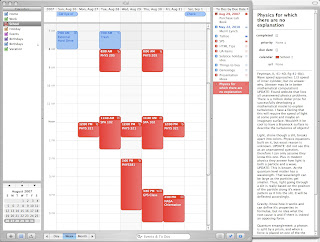
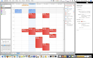
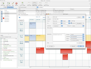
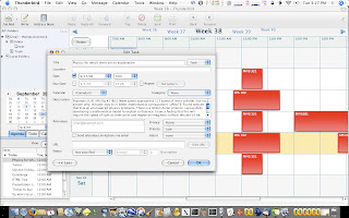
Here I've attached several screenshots of iCal, Sunbird, and Lightning. The first two are iCal showing the standard view, but noting that it can't change orientation, just month, day, week, etc. The right pane changes to give details on whatever is selected, whether it is a particular calendar, event, or todo item. This differs significantly from Sunbird where you can change the overall layout to horizontal, which I kind of like, maybe because it's different. But I haven't determined my feelings on the fact that to see details on anything I have to double click and then it shows up in a separate window. Incidentally, this second image is Lightning, the calendar plug-in for Thunderbird. I almost like it's appearance better than the stand-alone Sunbird. As you can see in both images, there are many more options compared to iCal. In a way. I noticed that Thunderbird has a limitation of only 2 email addresses for a person. As far as I can tell, addresses, email address, phone numbers, etc. are nearly limitless in Apple's Addressbook. This is a severely crippling limitation to Tbird. Anyway... There are still many other options not available in iCal, which is nice. Another limitation I did not expect was that in Lightning, if I wanted to add Attendees, people to be notified about some event via email, I thought it would grab the email address from a selected message or at least offer to let me choose it from the address book, but it does neither. Again, a condition that cripples the interface.
A feature I don't use often, but is none-the-less nice in iCal is that each event is given little icons as to what is associated with it. That is, I can look at an event and can tell by the icons if there is an alarm or notes associated with the event. There is nothing of the sort in Sunbird. In the end, Sunbird just isn't as clean and simple looking as iCal. The fact that it doesn't integrate perfectly with Thunderbird is a real shame, especially since I expected that they would have thought of that before anything else when developing Lightning. If I were to classify the 4 Mozilla apps in order of their strengths, it would be as follows.
In conclusion, you should help me by using the Apple Feedback link and letting Apple know how they can improve Safari. Oh, and incidentally Apple, I have to post these blogs in Firefox in order to have all the options for images and formatting. Sure I could do it all in HTML, but it's so much easier just to be able to use the tools.
Apple Feedback
A feature I don't use often, but is none-the-less nice in iCal is that each event is given little icons as to what is associated with it. That is, I can look at an event and can tell by the icons if there is an alarm or notes associated with the event. There is nothing of the sort in Sunbird. In the end, Sunbird just isn't as clean and simple looking as iCal. The fact that it doesn't integrate perfectly with Thunderbird is a real shame, especially since I expected that they would have thought of that before anything else when developing Lightning. If I were to classify the 4 Mozilla apps in order of their strengths, it would be as follows.
- Firefox (even better than Safari, lacking only in keychain integration)
- Thunderbird (stronger than Mail, but missing key features)
- Lightning (nice because it works in Thunderbird)
- Sunbird (Okay, but kludgy compared to iCal)
In conclusion, you should help me by using the Apple Feedback link and letting Apple know how they can improve Safari. Oh, and incidentally Apple, I have to post these blogs in Firefox in order to have all the options for images and formatting. Sure I could do it all in HTML, but it's so much easier just to be able to use the tools.
Apple Feedback
Mozilla Suite
I have just discovered that Mozilla offers a complete suite of tools for download. You can get Firefox (web browser), Thunderbird (mail program), and Sunbird (calendar) to handle all your PIM needs. Or sort of.
You know I like Firefox. And I've tried Thunderbird and like many of its features. I'm sure Sunbird is also a decent program. But now that I see all of these together, I'm reminded of one of the biggest benefits to OS X... Applescripts. Now, I don't do applescripting myself, but I use them all the time because they can make things so much easier. One of my favorite tools is Automator which I've used extensively to run my own scripts. One of the most useful scripts I created will scan pages from say a notebook, combine them into one pdf and email them to classmates. But I do like open source because it's always being developed actively. It also gets input from more people because it's available on many different platforms. This makes the Mozilla suite quite attractive. But...
As a mac user, I'm used to certain things now. I'm used to being able to automate a task with automator. I'm used to having all my passwords in one keychain that can be made accessible by any number of "Mac" programs. One thing I'm not used to is paying for add-ons and upgrades that are offered for free for the open source software (Except for 1Passwd, which seems to be an anomaly in the open source community. Why pay for an add-on to Mozilla to make it work better in Mac?). And yet, one would think that with this new Suite of tools offered by Mozilla that they'd work together better. Alas, I see no evidence that they share a common password database or whatever. Nor do they seem to share access to an address book.
Oh, but I like the looks. I love that Firefox can be made to look like Safari (I know, I'm one of the weird ones to like the brushed metal look). I only wish there were a similar theme for Tbird. Tbird has many options and plug-ins to make it fairly powerful, at least, compared to Apple Mail. By the way, I hated the appearance of Apple Mail so much that I had to download 3rd party hacks more or less to change the icons and get a vertical split (which works better on a widescreen laptop). I wouldn't be able to stand Mail if it weren't for these additions.
As an added bonus for those who like this, Lightening is a plug-in for TBird that puts Sunbird right in your email client. Now we're starting to feel like Outlook or Entourage. But for those of use who hate using multiple applications for all their PIM data, then this seems like an excellent way to go. And it is so much better looking that either Outlook or (and especially) Entourage which is so un-Maclike that no self-respecting Mac user, even a windows convert, would consider using it. Those are hasty words though. I have heard that Entourage is quite powerful, I just can't stand the interface, UGLY!
Interestingly, I looked at Sunbird and it recognized my iCal calendars. It didn't get the names correct on import, nor the colors, but the other data was the same. Even more interesting is that unlike Tbird, Sunbird does not allow you to change the view which I would have like to match that of iCal more. However, the calendars look similar and are just as easy to manipulate. One thing I noticed is that it is much slower than iCal. And I miss the feature of command-clicking on the calendars to select or deselect all. In Sunbird, you have to do it manually and it takes a second or longer to actually turn the calendar off. Lightning is the sunbird extension to Tbird. Now you can have your calendar in your mail client. I like it, and it looks better than the standalone Sunbird. With this, all you need now is stickies and you'll have a complete PIM solution for the cost of... nothing.
But I'm not yet ready to jump on the bandwagon. I'm still highly attached to my Apple software, even if it isn't as powerful by default. Plus, I miss smart folders. There are no smart folders in Tbird. This means that I have to manage everything by hand. Plus, it didn't import my address book, rules, or messages from my computer. This lack of support is at least enough to convince people that they don't want to go to the trouble of converting over to open source. But you're going to have to work at something. Either it's to put up with Apple deficiencies and paying for plug-ins to do what you want, or deal with the lack of integration, build your PIM information halfway from scratch and marvel at how much improvement has been made on this once lowly open source software. In a future review, after I've fully tested thing out, I'll discuss the direct comparisons of Thunderbird and Mail.
Apple Feedback
One other minor complaint about Safari
As if I didn't say enough to shoot down Safari, here's something that really annoys me. I'm sure this is an ex-windows user thing, but when I click on the big green plus sign, I expect the window to do one of two things. It should either maximize and fill the screen, or go to my predefined size and position. However, in Safari, it switches between my predefined and whatever Apple considers the sufficient size for the window. Personally, my predefined size was the sufficient size and position, so why should Apple tell me what is best? Again, this feature works as expected in Firefox. I'm sorry, but for me that's another nail in the coffin for Safari :(
Apple Feedback
Apple Feedback
Monday, September 3, 2007
Safari, Firefox, or Camino
I also want to add that sometimes I won't be offering suggestions for Apple improvements. This post for example will discuss my take on the best browser for Mac OS X. Why does this need to be discussed? Well, it doesn't need to, but it is certainly something of an issue out there in the Mac world.
The big problem, at least, from my perspective, is that Safari just isn't as well supported yet. The reason we use Safari is because of OS integration (period). Although, some claim it to be faster, I can't really tell, but I'm not a developer so what do I know? My take is simple, Firefox is available on practically every platform. For that reason, it is quickly becoming well supported. Most websites are now written to support Firefox. And if not Firefox, then IE. Safari is now available on windows, that might make it a bigger contender, and if adopted by the internet community it will thrive and maybe become one of the three big ones. Until then, there is only IE and Firefox.
What I am speaking in reference to is in plug-ins and other forms of support. While Quicktime is available everywhere, Windows Media Player doesn't integrate at all with Safari. Heck, I don't even know if it works with Firefox on OS X. But my point is that while I can browse the internet on my PC and download any number of plug-ins and viewers for special content, it's very limited in Safari. At least most of them are available for Firefox.
There are downsides though. Firefox doesn't integrate with the OS as well. Keychain is the biggest of the issues. I'm used to using Camino or Safari to log in to a new site and my login information will be saved in the system wide keychain. But Firefox doesn't have that, not natively. Which means that if I log into a site in Firefox and save my information, it is being stored in the built in password manager. That also means that I have to hunt through Firefox settings to get to it to see that password should I be on another computer and need that information. With Keychain, all I have to do is open it, and type in the spotlight search field to find my login. It's loads simpler. And I can set that same login keychain to be run in other applications like Cyberduck, Safari, or Camino.
There is a password utility out there that does integrate all the browsers and creates a new keychain to store all web passwords. It is called 1Passwd, but it costs $30. It does seem to do more than just store passwords, but since that is the main purpose, the price seems steep. Personally, I'm hoping that someone will just make a simple firefox plug-in to download for free. If I had a clue as to how to do applescripting I would do it. Alas, I cannot. But really, this is the only thing I can think of that I don't like about Firefox. I like the look of Safari, so I added a Safari brushed metal theme.
Here's one thing that Safari should include if it wants to compete with the other browsers on the market. Both Safari and Camino lack the ability to define a new folder when adding a new bookmark. This I find to be a real pain. In order to add a page to a new folder (which I do all the time as I'm a little OCD about file and folder organization) I have to manage bookmarks in a new tab and create the folder first. Then I have to go back to my other tab and click to add to bookmarks. This is such an annoyance. That was one of the reasons I stopped using both Safari and Camino.
Oh, and here's a Firefox tip for you. If you click on Bookmarks in the menubar, you only see an option to bookmark the current page. However, if you right (or apple-left) click the tab, you will have the option to bookmark all tabs, a feature I grew very accustomed to when researching software or stuff I wanted to buy. The best part is I can bookmark all tabs and put them in a new folder.
Apple Feedback
Labels:
Camino,
create folder in bookmarks,
Firefox,
Safari
Improve Mail Smart Folders
I recently wrote this request to Apple:
I love Apple Mail for its simplicity and ease of use. Plus, there are many plugins for it. But, one thing I would very much like to have if possible is a way to move folders into smart mailboxes. See, I don't like that every smart mailbox is listed and there's no way to organize them. For example, lets say I want to have a Smart Mailbox for everything that comes from the University of Arizona. So I set it to grab everything with arizona.edu in the From field. But then, lets say I want to further limit by department. So I create a Smart Mailbox for lpl.arizona.edu. But I don't want to see that right below the first, I would like it nested in the first. The idea is that rather than create tons of other mailboxes that rely on rules or manual separation, I'd prefer to keep all messages in a generic archive and have the smart mailboxes do real time filtering for me. Then I only have to maintain a select few standard folders.
[EDIT] I discovered that this complaint was out of shear stupidity. Apple added a feature called "Smart Mailbox Folder" that can store smart mailboxes. Thus, this complaint or bug report, was actually a case of user brightness level set too low.
If any of my readers agree with this post, please send Apple a similar request.
Introduction
I decided that Apple is less likely to make any improvements I suggest unless more people suggest the same. So, I created this blog to make comments on and talk about apple products and hopefully get others to read it and follow the link to apple to suggest the same fixes or improvements.
First, my name is Tom. I am 29 years old and a full time student at the University of Arizona. I have only been using Macs for the last year when I used money from a summer internship to buy my 13" Macbook. However, I have built and configured both windows and linux boxes over the years (less on the linux, more on the windows). I feel this gives me a good ground to knowing what some types of applications should do. Since I've been using OS X 10.4 I have been quite happy with most of the built in software. But, occasionally I come across a bug or desire a feature that isn't standard that I believe should be. Thus, this blog was born. If anyone agrees or doesn't agree with anything I've said, please leave a comment and let me know. I want to know why you don't agree. However, I do ask that you try to be professional about it, try not to be insulting. If people can't follow that simple rule, I'll be forced to approve all comments and I really don't want to do that. Also, I'll include a link to Apple's feedback page for OS X 10.4. Please use that link to help me promote get through to Apple and get some real changes made.
With that, I'm off. Look for my next post about Apple Mail.
Subscribe to:
Posts (Atom)